Monday, December 19, 2022

Garden Shoppe Layouts for Scrap Shotz

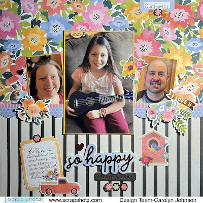
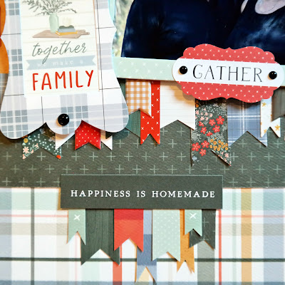
  Today I have two layouts using the fabulous November kit featuring the Paige Evans "Garden Shoppe" Collection available at Scrap Shotz.


For this layout, I was inspired by the December sketch in the Creative Scrapbooker Magazine Facebook Sketchy group


I began by using the Yukon Gold cardstock to matte my photos. Then I used a variety of papers and a stencil to cover the page. 


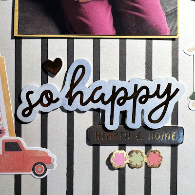
The pink border in the middle is washi tape. The rest of the layout is full of Thicker stickerslayered stickersephemera and stickers from the awesome sticker book


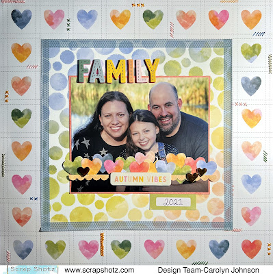
The second layout features one of the papers in the kit. I cut the center out of the paper to create a border. Then I used the washi tape to cover the seam between the two papers. 


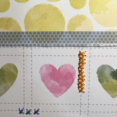
The paper actually has the stitching drawn on it, so I stitched over it to add some texture. 


The title matches perfectly with the stitching and come with the Thicker alpha set. The hearts in the center are cut from the paper that I removed from the center. They are actually covering up the words "Merry Christmas" as this was our card from last year. Shhh, don't tell anyone! 


Thanks so much for stopping by today!

Monday, December 12, 2022

Garden Shoppe Interactive Card for Scrap Shotz

 Hello everyone! I saw a really cool card on Instagram @rippels_paperlover and thought I would give it a try for my daughter's birthday. It was a big hit! I've put together a tutorial using the Paige Evans "Garden Shoppe" Collection in the November kit

Here is a video to show how it works:


I made a cut file on my Silhouette so I can easily make another card in the future. Here is a picture with the dimensions so you can make it yourself using a crafting knife or cutting machine.


Next, I scored the folds into the card by using a palette knife and my paper cutter. 


The scores should be 3 inches long vertically and 1.5 inches horizontally. 


Here is how to fold the card. Step 1 - Bring the left side towards the middle and let the center flip around.


Step 2: Repeat on the right side. 


Step 3: Flip the paper over.
Step 4: Bend the square piece at the top backwards so it now looks like the picture below.


Step 5: Repeat with the square at the bottom flipping it towards the back. It should now look like the picture below.


Step 6: Now you can open up the card and lay it flat on the table. I marked all the sections with the word "up" so I could easily cut the papers that go on top in the right direction. 


Step 7: Flip the paper over and write the word "up" on each section. However, be careful, some sections are upside down. 


Step 8: Begin cutting papers to adhere to the card. I found that by cutting a second card on my machine and then cutting out each section, I could use those pieces as stencils and trace them. 

Side 1: I used one piece of paper and cut it into sections. Then I made a title with the alpha Thickers. I also used some Thickers for the leaves and hearts. There are a few stickers from the sticker book. The sections are outlined with washi tape. Finally, the flowers are from the die cut pack


Side 2: I used the button paper and added the title with Thickers.


Side 3: This is what the card looks like with the top sections flipped back.


Side 4: I used the alphas from the sticker book for the title. I used some die cuts to decorate and embroidery thread to make bows. The flowers are from the layered sticker pack.


There you have it! I hope you have a chance to try it out!

Tuesday, November 8, 2022

Carta Bella "Welcome Fall" Layouts for Scrap Shotz Part 2

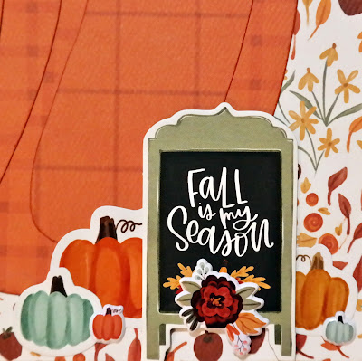
 Hello crafty friends! Today I have two more layouts with the Carta Bella "Welcome Fall" collection. This collection is all about leaves, pumpkins, oranges and yellows and don't forget the plaid!


My first layout was inspired by the November sketch in the Creative Scrapbooker Sketchy Facebook Group

I couldn't figure out a long title so I used some stickers and chipboard to make titles horizontally. Otherwise, I stuck to the sketch pretty well. After cutting out all the papers and pictures, I added a border to my pictures to make them the same size as the middle card. I used a white pen to draw the stitching border and to journal. 


Lots of chipboard and cardstock stickers were used to embellish the page. I used some foam dots on the back of some of the stickers to pop them off the page.


My second layout was fun to make! 


I fussy cut all those leaves from one piece of paper. Good thing there was something good to watch on Netflix at the same time. I used some glue dots to stick them all down. It worked really well because the entire leaf isn't stuck to the paper so it looks more layered. I could also move the leaves later if I didn't like their placement. 


This time I used some puffy stickers and ephemera for the embellishments. 


PS - no children were hurt during the sword fight:)


Thanks for stopping by today. Have a scrappy day!

Monday, October 31, 2022

Carta Bella Welcome Fall Layouts for Scrap Shotz

Hello everyone! I'm so excited to show you the Carta Bella "Welcome Fall" collection available at Scrap Shotz! I love how there are so many basic pattern papers to choose from. It's so easy to build a layout without it looking too crazy.


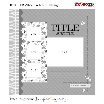
My first layout was inspired by the October sketch in the Creative Scrapbooker Magazine Sketchy Group on Facebook. I stuck pretty darn close to the sketch. My pictures were a bit larger than the dimensions on the sketch so I couldn't fit the embellishing on the right. 

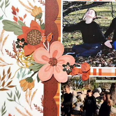
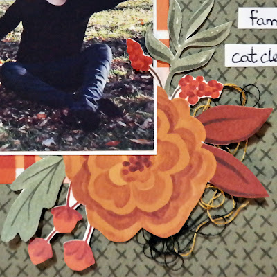
I used a stencil to cut out the scallop border and matted my pictures with white paper before taping them down. I love all the flowers on this page but they all had to be fussy cut from one of the papers in the kit so it took some time.


The rest of the layout is made with a chipboard title and a couple tags from the ephemera pack. I shoved a little bit of embroidery thread under the flowers to add some texture. Also, I couldn't forget the picture of the random cat that followed us through the park. He kept everyone entertained while we froze!


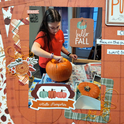
Layout number 2 was inspired by one of the pumpkin stickers (see the largest pumpkin sticker on the bottom right corner). I noticed how it has darker outer sections and lighter middle sections. So I drew by hand the three lobes of the pumpkin on a darker orange paper. On the lighter orange paper I traced the three larger lobes and then drew another circle about an inch smaller inside of them. I also drew the stems by hand using that same pumpkin as a guide. I wanted the sections to pop a little bit because they are very similar in colour so I inked the edges of the papers to make them a bit darker.


The ephemera tag kit comes with a few frames so I used them behind my picture. 


I used a chipboard piece for the title and a bunch of cardstock stickers in the bottom right corner. The final touch were a few puffy stickers and embroidery thread to add interest.


Thank-you for checking out the layouts. I'll be back later in the week with more!

Tuesday, September 20, 2022

More Simple Stories Simple Vintage Lakeside Layouts for Scrap Shotz

 I'm back again to give you even more inspiration with the Scrap Shotz September kit featuring the Simple Stories Simple Vintage Lakeside Collection. I'm pumped that I was able to scrap even more pictures from our lake time a few summers ago. It's so nice when the same collection can cover a lot of pictures that are all together in an album. 


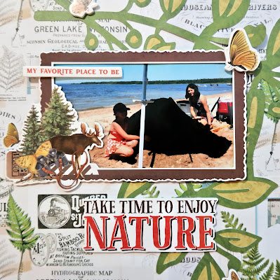
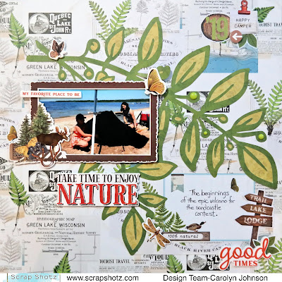
For this layout, I decided to use a cut file I found in the Silhouette Store. I cut the dark green paper and then backed the leaves by hand with light green paper. I debated putting some white gesso behind the cut file but decided that I wanted more of the background to show through. 


I love the frames that came in the kit so I had to use another one. The journaling is on a cut-apart card that has the same background so it blends nicely. The embellishments are foam stickerscardstock stickers, sticker book stickers, bits and pieces and enamel dots. 


This layout was pretty easy to make - just lining up the photos was the hardest part. I used the sticker book for the title. There are 3 sets of alphas in it. I layered a variety of cardstock, foam and sticker book stickers to embellish the pictures. The journaling is on a cut apart card that matches the background paper. 


Thanks for stopping by today! Have a scrappy day!

Friday, September 16, 2022

Simple Stories Simple Vintage Lakeside

 Hello everyone! I hope everyone enjoyed the summer. I sure did and what better kit for September than one to scrap all those photos! The September kit features the Simple Stories Simple Vintage Lakeside Collection. There is so much in this kit! The sticker book is a cool new product and add-on to work with. It just adds so many more options for embellishing.

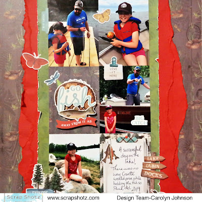
My first layout used the September sketch from Creative Scrapbooker Magazine's sketchy Facebook group. It gets a lot of pictures on the page and if you don't have enough pictures, there are lots of cut apart cards in the kit to choose from. 

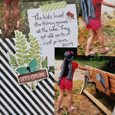
I used two cut apart cards along with my pictures. One of them didn't have a design that I liked so I used some foam stickers and cardstock stickers to create a title over top of the original picture. I tore some of the cardstock in the kit to create the borders and just distressed the green border paper so the project didn't get too messy. I used a few stickers from the sticker book to finish off the layout.


My second layout I used one of the frames that came with the kit. I love premade frames! The border is from one of the papers in the kit and lots of the embellishments are in the bits and pieces pack. I clustered things in groups of three to make visual triangles. The enamel dots helped to add some variety in the size of embellishments. 


I tried to do something a little different with the journaling. I used some words from the sticker book amongst my journaling. A challenge but I think it worked!


Thanks for stopping by and have fun with your September kits!

Monday, June 27, 2022

Carta Bella Farmhouse Summer Layout Part 2

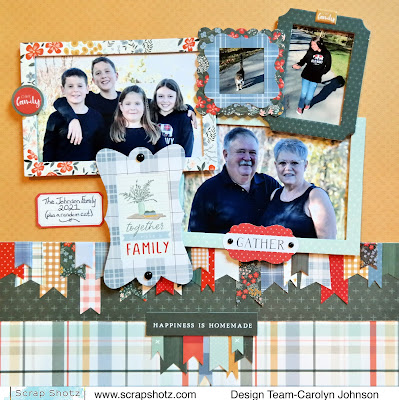
Have you been playing with your June Kit from Scrap Shotz? I have! I've made a layout using some family photos we took in the fall. The Carta Bella "Farmhouse Summer" Collection is perfect for family photos.


I began with all the frames that came in the kit. Some are made of chipboard and others are in the ephemera pack. I matched my photos to the frames and decided to cut apart the picture of the cat and my daughter so they could each have a frame. I knew I wanted to make a row of flags when I saw all the different sizes and shapes of flags in the kit. Some are puffy stickers, some are cardstock stickers and some are ephemera. I ran out of the green paper however, so I had to add a third row of paper. But it worked out ok because the frames kind of point into a triangle and I could add a second row of flags. The final touches included adding some enamel dots and ephemera tags. My favourite part of the layout is the journaling. It says, "The Johnson Family (plus a random cat)". This cat followed us through the whole park and really did want to be a part of our family.

Here is a close-up of all those flags. I cut them out without peeling the stickers off their backing so I could move them around until I found a layout I liked. 


Thanks for taking a peek at my layout! Have a scrappy summer everyone!

Friday, June 17, 2022

Farmhouse Summer Carta Bella June Kit from Scrap Shotz

 Hello everyone! I'm working with the June kit today which features the Carta Bella - Farmhouse Summer Collection. It has yellow, red, green and blue in darker and lighter shades and features lots of bits and pieces to make those cards and layouts. I decided to scrap a picture of one of our home renovation projects since there are lots of references to 'home' in this kit. I tried to tackle some home renos through COVID and convinced my child to help me for all of five minutes! 

I used a sketch from Creative Scrapbooker Magazine's Sketchy Facebook Group. Lots of inspiration there if you need to kick start your creativity. The sketch is from June. 


I started by choosing the three background papers. I love the look of 4 pictures but I couldn't find 4 that had the same size and theme so I used one and 2 cut-apart cards. I framed the photo with white paper and then used a punch to make a frame from patterned paper. The journaling framed by a frame in the ephemera pack. The title is from the chipboard phrases pack. The remaining embellishments are a combination of cardstock stickers, puffy stickers and enamel dots

I'll be back with more of the June kit next week!

Thanks for stopping by!

Friday, June 3, 2022

Simple Stories Simple Vintage Indigo Garden Kit from Scrap Shotz

Hello everyone! I've been working with the March kit which features the Simple Stories Simple Vintage Indigo Garden Collection. I love indigo and flowers so this was the perfect kit for spring. If you missed out on this kit, there are still some available in the shop. 


For the first layout, I used one of the papers that already has all those flowers and butterflies. I cut a strip off each side and attached strips from another piece of paper. I tore some green and pink papers to put behind my photos. The rest is embellished with bradsfoam stickers and thread.


The second layout uses a little bit of everything! I used white gesso to cover two strips down the yellow paper. I tore two pieces of floral paper and glued them to the gesso. I used brown ink and a stamp from a previous kit to stamp the branches around the page. Next, I added the photos and the embellishments which included ephemera and cardstock stickers. I finished it off with some brown paint splatters.


The final layout uses one of the papers that already has flowers and butterflies printed in a circle. To add dimension, I layered more on top. I fussy cut several flowers and used a doily as a frame. I bent the edges of the flowers and butterflies so they lift off the page. This was a really fun layout to make trying to use all the different types of embellishments!
Thanks for stopping by! Have a great day!