Friday, April 29, 2016

Easter Layout

I don't have many Easter supplies so I found this page more challenging than I expected. I used the Scrappy Friends Challenges as inspiration but couldn't make the sketches work as all my pictures were vertical and the sketches were horizontal. It looked kinda funny when I rotated the sketches so I just did my own thing and entered 2 instead of 3 challenges.

 
I began with the mood board and chose to go with the Easter theme and colors. It is at Creating With Paper and More.
 
 
I'm also joining Rochelle Spears's challenge and used a journal card in the corner.


Supplies
Egg center paper - Moxxie: Easter
Pink paper - Pebbles: Basics
Blue and purple paper - the stash
Butterfly and pizza mesh - Dollarama
Flowers, title, journal card - the stash
Gems - Kaiserkraft
Embroidery thread
Friskar's punch
Egg cut file - Paper Issues

Thanks for stopping by!

Let's Scream Layout - DT Sketches In Thyme

This picture was taken two summers ago when I took the kids to the wading pool. We didn't realize how cold it was so they played for a bit but gave up. We went to the car to change and warm-up but there was still time before the boys would be picked up so we read library books in the car. It was so much fun reading to a group of kids instead of just one. At some point they all thought it would be a good idea to scream so I got a decent picture.

 
I used a sketch created by Brenschevia for Sketches In Thyme. It is such a fun sketch, I encourage you to try it!

 
I only bought two pieces of paper from this collection as that was all that was in stock. I somehow managed to get it to work - although the yellow and blue pieces are from another collection. I'm such a paper hoarder, the back of this layout is covered in holes trying to spare every piece!
 
I'm also joining in the challenge at Pinkfresh Studio which is to use thread on a layout.
 
Supplies
Paper - Amy Tangerine: Better Together
Yellow paper - DCWV Basics Bold
Blue cardstock - the stash
Wood arrows - Simple Stories: Life Documented
Blue letters - Bella Blvd: Lucky Starz
Yellow letters - Sassafras: Item 21131
Wood pieces - the stash (garage sale find!)
Thread - the stash
 
Thanks for stopping by!

Wednesday, April 27, 2016

To The Right Layout

My daughter loves driving this little car. I can't say her cousin loves being the passenger but they sure are cute together.


I was inspired by the April 1 sketch at Stuck?! Sketches. I love all the white space but I think I went a little crazy because there isn't much left in my layout! I really wanted to use my Attwell supplies but I've used a lot of it so I've got some interesting matting happening. I kind of like how it turned out. The best part is the title. I really, really wanted to use my Amy Tan words but I have hardly any left so I was able to make this phrase. It kinda works with the driving theme, right? Or can you tell I didn't have enough words to work with - ha ha?

 
I also was inspired by the mood board at Off The Rails. I love these colours and knew the Attwell collection would work well. The handwritten title came from the handwritten note on the mood board. The title of the mood board is "water colors" so I made sure to use the "Stunning" paper which looks like a painting and then I splattered some paint as that is the extent of my painting abilities!
 

Supplies
Paper, Washi & Tag - Fancy Pants: Attwell
Title - Amy Tangerine: Today
Black Embossing Powder - Close To My Heart
Doily - Michael's
Stickers - Bella Blvd: Tiny Tots, Valentina, Campout, Playdate, Fresh Market
Enamel Pieces - My Mind's Eye: Jubilee Tangerine Awesome & Necessities Red
Black Paint
Red and Black Cardstock
Chipboard Flowers and Centers - the stash
 
Thanks for stopping by!

Monday, April 25, 2016

Road Trip Layout

My little one was so excited to spend a day with her grandparents and cousins. We weren't sure if there was room in the car for three kids but there was and they had a great day!

 
I used the sketch for the April Stack-a-holic challenge as my starting point. I've always wanted to make circles like in the sketch but I'll have to do it another time. The roads worked better with my theme:)


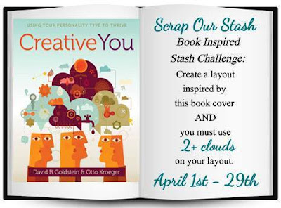
I used the April 1st challenge at Scrap Our Stash to inspire the rest of my layout. I picked this paper initially because there are clouds which covers the requirement to have 2 or more clouds. Then the rest of the stack was perfect for the color scheme in the book picture (blue, orange and green) and I liked that I could use arrows like in the picture.
 
 
I'm also participating in the Anything Goes challenge at Clique Kits.
 
Supplies
Paper - DCWV: The Great Vacation Stack
Date - Recollections stickers
Spiral die cut - the stash
Ink - Fine tip sharpie pen
 
Thanks for stopping by!

Wednesday, April 20, 2016

Lovely Lily Midweek Mojo

Hi there. Just putting together a post with all 10 layouts for the finale of the Scrapbook Steals Midweek Mojo so I don't have to link up 10 posts:) Enjoy. This was my first time participating so I'm really impressed with how many layouts I got done! Thanks for the motivation/inspiration!

Lily 10
 
Lily 9
 
Lily 8
 
Lily 7
 
Lily 6
 
Lily 5
 
Lily 4
 
Lily 3
 
Lily 2
 
Lily 1
 
 
Thanks for stopping by!

Tuesday, April 19, 2016

Explore Layout

I'm still a newbie to mixed media and was pretty scared when I began this layout but now that it has all the layers, I'm pretty happy with it. The paint didn't look right but I kept telling myself I would be covering it up so all is well.


I used the sketch from the Midweek Mojo Lily 10.
I used a cut file from Paper Issues and will be entering it in the cut file challenge for this month in their Facebook group.
 
I'm also playing along at Clique Kits for the Anything Goes challenge.
 
Supplies
Fancy Pants: Office Suite
Buttons
Watercolors
Gesso
Number stamp
Fine tip Sharpie
 
Thanks for stopping by!

Wednesday, April 13, 2016

Hello Lovely Layout

I named this layout "Hello Lovely" but really it should be "Can't Wait To Get This Done Because It Is Driving Me Crazy". I just couldn't get things to work the way I wanted and spent way too long on it but I think it finally turned out ok. I love this picture of my daughter and the colours in it. She never wears jeans so I had to get proof when she did this one time.


I used the sketch from My Creative Sketches. I struggled to find matching paper to fill that large strip on the right since I was using a 6 x 6 pad. It's busier than I like but sometimes it's good to work outside the comfort zone. At least that is what I'm telling myself. Ha!

 
I also used this picture from Creative Embellishments as inspiration. I chose to use the strips of paper to match the rainbow. I used a butterfly and hearts and tried to add some movement to the layout with the butterfly trail and loopy frame. I used "lovely" chipboard and the butterfly chipboard from Creative Embellishments. I chose the butterfly to match my daughter's butterfly shirt and the inspiration picture. The twist this month is to use a song title for the layout. I chose the beautiful song, "Hello Lovely" by The Likes Of Us.
 
lyrical_color_collage_music_cool_abstract_hd-wallpaper-594031

Supplies
Chipboard - Creative Embellishments
Background paper - Close To My Heart: My Reflections
Paper - Simple Stories: Life Documented 6 x 6 pad
Tiny Word Stickers - My Mind's Eye: Collectable
Hearts - Simple Stories: I Am and Carpe Diem
Date - Fancy Pants: Me-ology
Splatter - White Gesso
Black Embossing Powder - Close To My Heart
Glitter - Recollections: Neon Pink and Neon Blue
White Pencil Crayon
Swirl Punch
Loopy Frame - Silhouette Store
 
Thanks for stopping by!

Saturday, April 9, 2016

New York Almost Layout

During our trip to LEGOLAND we spent the most time here in the miniature cities. Pushing every button multiple times was a must.

 
I began this page by printing off a bunch of inspiration material for the whole month. This magazine cover from Paper Crafter's Corner Magazine Monday's Week 139 was a part of it. I found this piece of paper in a lot of material I bought off Kijiji this week. I couldn't believe how the stripes in the paper matched the building. I flipped through my pictures and found these ones of buildings. I had no idea how I was going to scrap these pictures so I'm really happy with how this turned out! Then I pulled the topper from one of the buildings on the magazine cover. Then I searched the Internet for a free font and I found this one called the New Yorker!
 
Papercrafting Challenge: Magazine Mondays - Week 139 Inspiration Piece (image)
 
I'm also participating in the Clique Kit's Anything Goes Challenge. 

Supplies
Background Paper - I'm going to guess it is from Basic Grey
Title - New Yorker Font cut on Silhouette Cameo onto DCWV Cardstock
Wood Pieces, Stars, Gems and Other Papers- the stash
Subtitle - Fancy Pants: Me-ology
Apple - October Afternoon: Apple Cider
 
Thanks for stopping by!

Friday, April 8, 2016

Love Layout

My daughter was wearing bells on her ankles and hitting a drum in her hands. It made for quite a racket but also a good picture.

 
I used the sketch from this week's Midweek Mojo Lily #9. I flipped the diagonal lines and put the top cluster as a picture on the bottom. I really wanted to use the paper with all the words so I had to tweek the layering so I could show it off. I still used the 6 papers but their sizes are different. I fussy cut all the flowers and the bird. There is another bird under the red paper but I liked this one better.
 
 
Supplies
Paper - Simple Stories: Life In Color (6x6 size)
Background Paper - DCWV: Songbird Stack
Plain Red Paper - the stash
Stickers - Simple Stories: You & Me
Enamel Dots - Recollections
Brad & Hook - the stash
Numbers - Bella Blvd: Lucky Stars
Yellow Arrow - DCWV: Snapshot Stack

Thanks for stopping by!

Monday, April 4, 2016

Most Annoying Sound Layout

I've been waiting for the perfect moment to scrap these pictures. They are so funny I wanted to make sure I did them justice. Paper Issues had a fun challenge this week in their Facebook group to scraplift a layout with a giant title. Everyone's submissions were so funny it made me think of these pictures.

 
Supplies
Paper - Craft Smith: Boho Tropical
Flourish - Scrap Works: Magpie Collection
Ampersand - American Crafts: Beautiful #79
Sequins - Fancy Pants: Oh Deer and The Stash
Fonts with Silhouette - Snap and Vagabond
 
Thanks for stopping by!
Saturday, April 2, 2016

Touchdown Layout

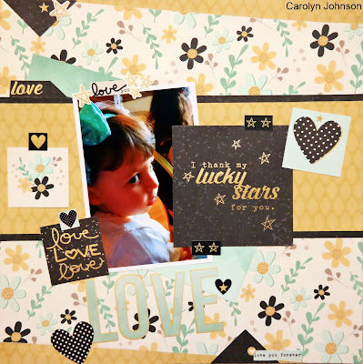
My husband's work rented the CFL stadium for a party last summer. BTW - the poutine there was amazing! My daughter was hilarious trying to knock over this equipment. She must've tried 20 times and then needed one of us to push it down. I think she's going to stick with soccer for awhile.

 
I used the sketch from the Midweek Mojo Lily #8. I had such a hard time getting the background papers to work. I cut them all trying to show off their best features but once they were taped together it was obvious they were too big. I took it all apart and recut them so they now look like they were meant for the space. Then my husband says, "You know that she is not scoring a touchdown so your title is wrong". Well, the title, "Watch Me Knock Over The Big Blue Thing" was too long for the space so "Touchdown" it is!
 
Lily_8_Sketch.png

I'm also entering the Take 5 Challenge at Paper Issues. I used yellow, blue, white, butterfly (animal) and a title.

Supplies
Paper - Bo Bunny: The Sweet Life
Butterflies - Heidi Swapp
Numbers - American Crafts: Boardwalk Honeycomb 133
Yellow Letters - Simple Stories: SNAP!
Pink Letters - the stash
Spread Your Wings Sticker - My Mind's Eye: Collectable
I Am Strong Sticker - Simple Stories: I Am
Tags (bottom right) - Teresa Collins: Urban Market
Camera - the stash

Thanks for stopping by!