I'm back again to give you even more inspiration with the Scrap Shotz September kit featuring the Simple Stories Simple Vintage Lakeside Collection. I'm pumped that I was able to scrap even more pictures from our lake time a few summers ago. It's so nice when the same collection can cover a lot of pictures that are all together in an album.
Tuesday, September 20, 2022
More Simple Stories Simple Vintage Lakeside Layouts for Scrap Shotz
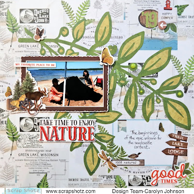
For this layout, I decided to use a cut file I found in the Silhouette Store. I cut the dark green paper and then backed the leaves by hand with light green paper. I debated putting some white gesso behind the cut file but decided that I wanted more of the background to show through.
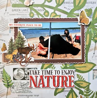
I love the frames that came in the kit so I had to use another one. The journaling is on a cut-apart card that has the same background so it blends nicely. The embellishments are foam stickers, cardstock stickers, sticker book stickers, bits and pieces and enamel dots.
This layout was pretty easy to make - just lining up the photos was the hardest part. I used the sticker book for the title. There are 3 sets of alphas in it. I layered a variety of cardstock, foam and sticker book stickers to embellish the pictures. The journaling is on a cut apart card that matches the background paper.
Thanks for stopping by today! Have a scrappy day!
Friday, September 16, 2022
Simple Stories Simple Vintage Lakeside
Hello everyone! I hope everyone enjoyed the summer. I sure did and what better kit for September than one to scrap all those photos! The September kit features the Simple Stories Simple Vintage Lakeside Collection. There is so much in this kit! The sticker book is a cool new product and add-on to work with. It just adds so many more options for embellishing.
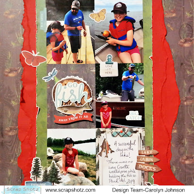
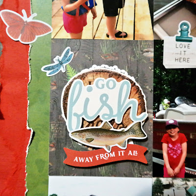
My first layout used the September sketch from Creative Scrapbooker Magazine's sketchy Facebook group. It gets a lot of pictures on the page and if you don't have enough pictures, there are lots of cut apart cards in the kit to choose from.
I used two cut apart cards along with my pictures. One of them didn't have a design that I liked so I used some foam stickers and cardstock stickers to create a title over top of the original picture. I tore some of the cardstock in the kit to create the borders and just distressed the green border paper so the project didn't get too messy. I used a few stickers from the sticker book to finish off the layout.
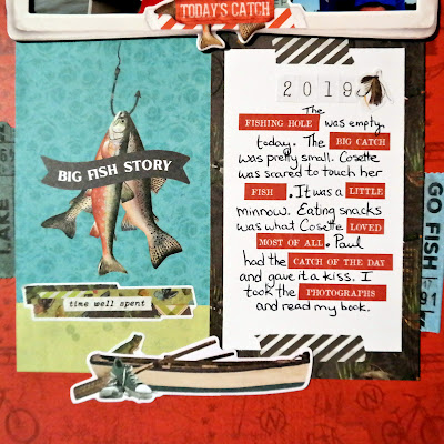
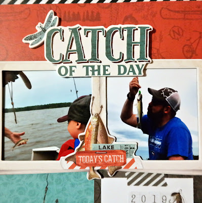
My second layout I used one of the frames that came with the kit. I love premade frames! The border is from one of the papers in the kit and lots of the embellishments are in the bits and pieces pack. I clustered things in groups of three to make visual triangles. The enamel dots helped to add some variety in the size of embellishments.
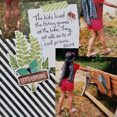
I tried to do something a little different with the journaling. I used some words from the sticker book amongst my journaling. A challenge but I think it worked!
Thanks for stopping by and have fun with your September kits!
Subscribe to:
Comments (Atom)

